to shape expressive and impactful brands.

SUMMARY
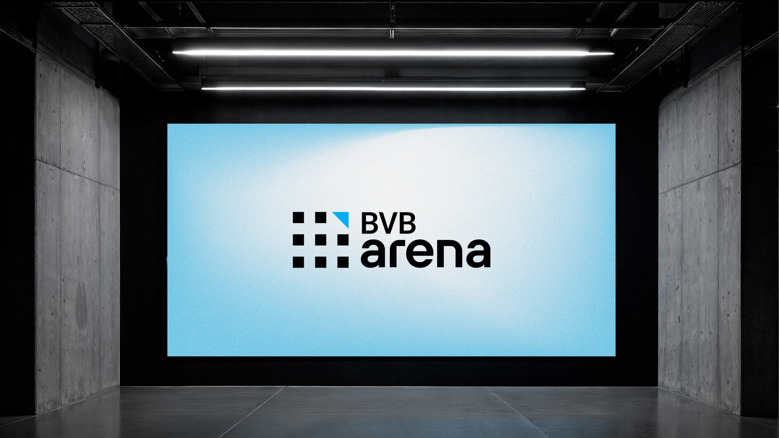
BURSA DE VALORI BUCUREȘTI
Context:
At a time when the capital market was beginning to spark interest, the Bucharest Stock Exchange (BVB) remained off the radar for pragmatic, forward-thinking Romanians — those who understand that long-term vision means realizing today's actions shape tomorrow’s outcomes.
In response, BVB set out to become the natural choice for every Romanian investor and a powerful catalyst for the growth of Romanian companies.
CLIENT:
Bucharest Stock Exchange
BRAND:
EN: Bucharest Stock Exchange
RO: Bursa De Valori București
INDUSTRY:
Investment, Financial Services
TASK:
Repositioning Strategy, Identity Redesign

The Brief / The Challenge:
Our task was to help the brand's evolution by developing a brand strategy that serves as the foundation not only for the new visual identity, but also for every piece of communication and by rethinking the entire visual rhetoric — starting with the logo and tagline, and continuing with the design system and visual vocabulary that will define the brand in every expression.
The core need was to define a modern, relevant visual style and language — one that attracts new companies, partners, and investors, while reinforcing the brand’s role as the central hub of the local capital market and a benchmark for the economy’s evolution.

The Solution / The Design Concept:
With the new identity, our aim was to position the BVB brand within today’s context — one shaped by digitalization — by giving it a minimalist, scalable, and easily recognizable form.
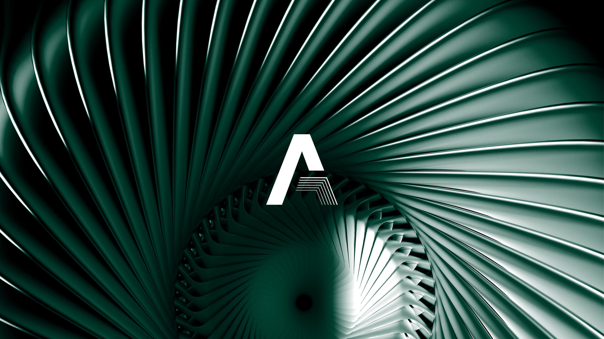
The symbol is a stylized reinterpretation of the previous one, drawing inspiration from Romanian iconography in both concept and execution. In its new shape, it seamlessly blends past and future, embodying the values that have driven BVB’s evolution over time.
Every element developed — from the strategic territory to the visual rhetoric and vocabulary — was designed to build a brand that is dynamic, agile, and contemporary. Our guiding objective was to ensure that through this new identity, BVB speaks the same language as its audiences — to be seen as approachable, engaging, and a compelling choice for medium and long-term investment.

Inspired by the brand symbol, the visual system weaves a cohesive and consistent identity across every channel. It ensures that BVB’s messages don’t just appear - they stand out, instantly recognizable wherever they go.


MORE PROJECTS


Follow us
Work
About
Contact
©2025 BRAND NEW