to shape expressive and impactful brands.
SUMMARY
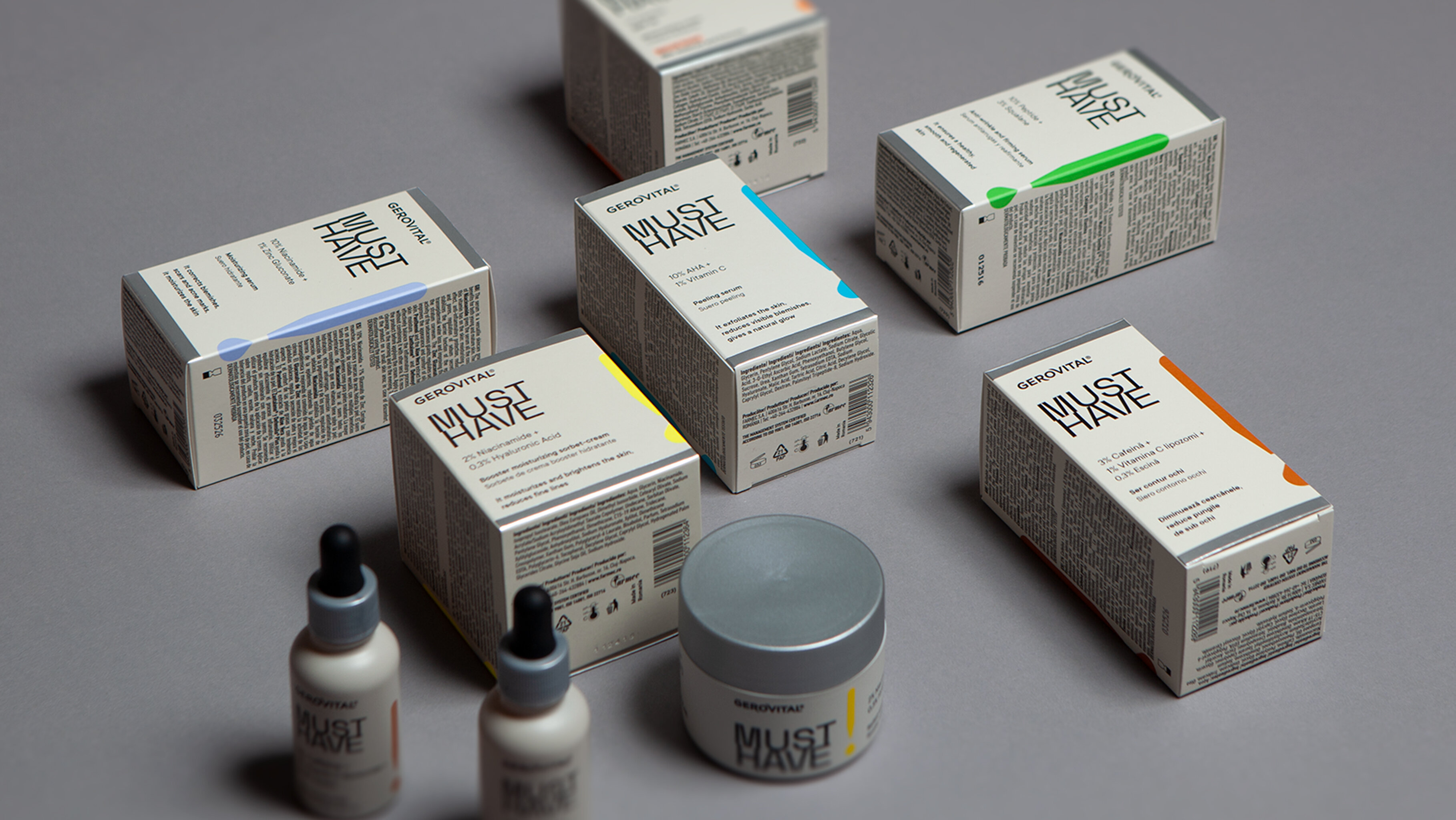
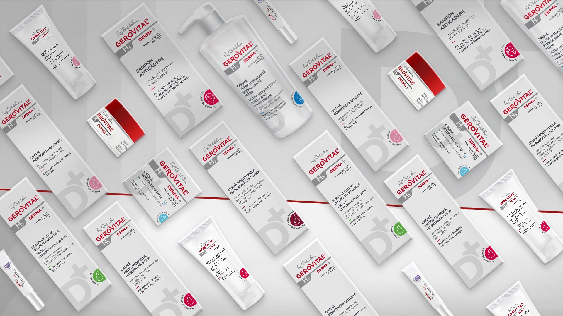
DERMA+ by GEROVITAL
Context:
International dermo cosmetic brands are investing heavily in both product innovation and promotion. What’s more, new brands are emerging at an accelerated pace — sometimes several from the same manufacturer.
In this highly competitive landscape, Gerovital dermo cosmetics brand have gained market share in a remarkably short time, in a segment traditionally dominated by powerful global players.
The quality of the Derma+ range became widely recognized and appreciated by consumers, dermatologists, and pharmacists alike — backed by a team of experienced researchers and strategic collaborations with industry experts.
CLIENT:
Farmec
BRAND:
Gerovital Derma+
INDUSTRY:
Cosmetics
TASK:
Packaging Design

The Brief / The Challenge:
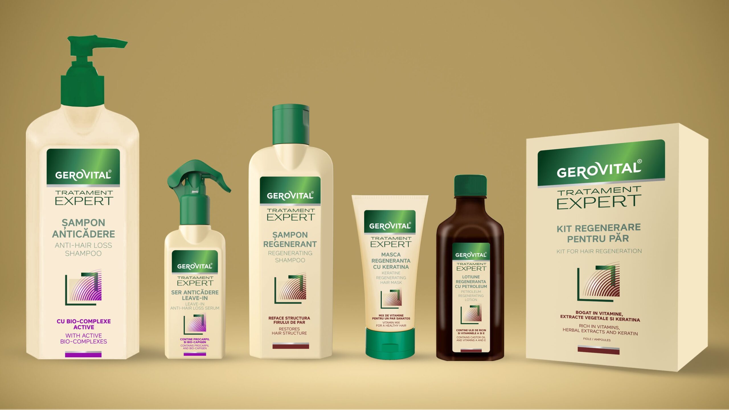
GEROVITAL DERMA+ needs to keep pace by refreshing both its product range and its image — standing apart from standard cosmetics through a design language with a subtle, medical-inspired aesthetic.
The Solution / The Design Concept
The design approach focused, on one hand, on preserving key brand properties — such as the logo and color palette — and, on the other hand, on introducing new visual elements that position GEROVITAL DERMA+ as a modern, innovative dermo cosmetic brand.
Graphic elements and structured information were carefully chosen to reinforce the brand’s credibility, expertise, and scientific know-how.
Another key objective was to build a coherent design system that simplifies portfolio navigation — segmenting products based on treatment protocols as well as by face, body, and hair categories.


MORE PROJECTS


Follow us
Work
About
Contact
©2025 BRAND NEW