to shape expressive and impactful brands.
SUMMARY
MATACHE MĂCELARUL
Context:
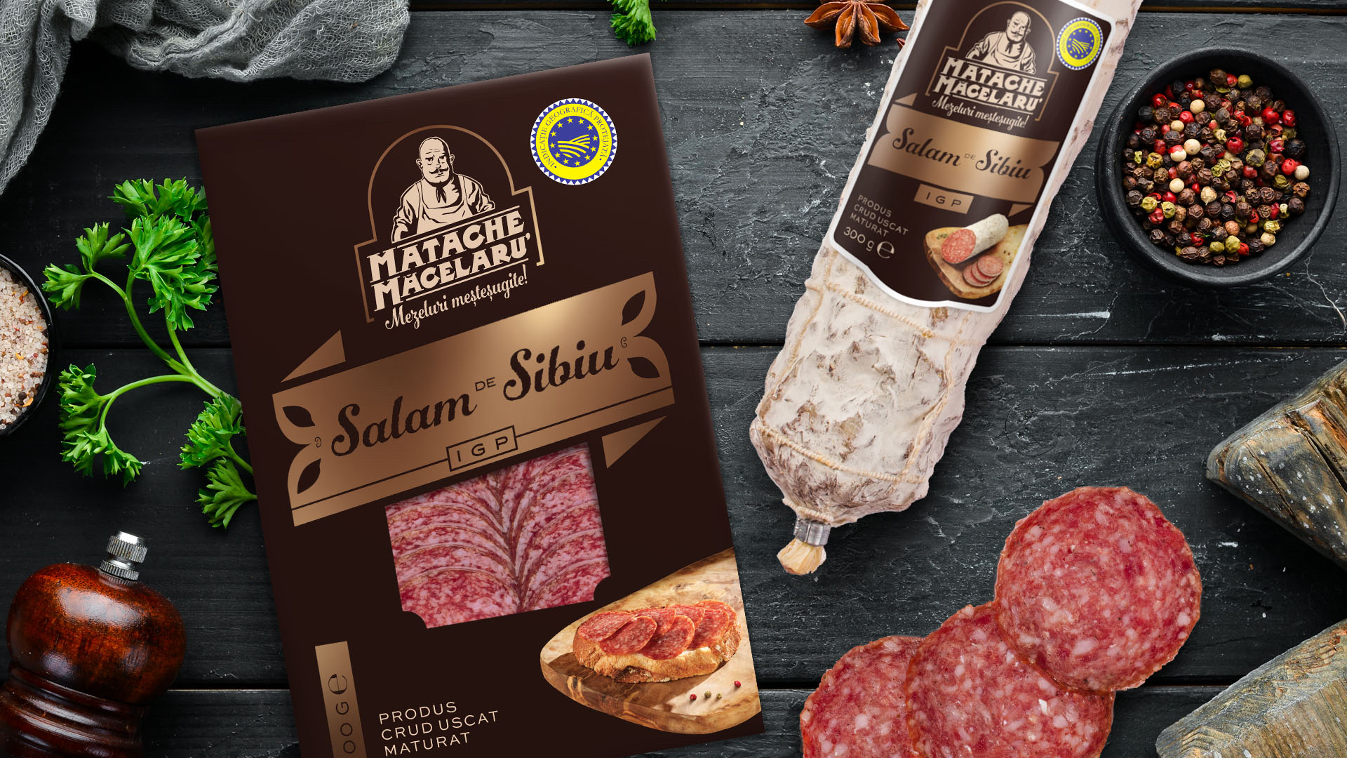
The well-known Romanian cold cuts brand Matache Măcelaru proudly expands its product portfolio with a true staple of local culinary tradition — Salam de Sibiu. A product already celebrated within the Cristim group, Salam de Sibiu now finds its place under the Matache Măcelaru label, bringing together heritage, craftsmanship, and exceptional quality.
This addition reflects the brand’s commitment to honoring Romanian charcuterie traditions while offering consumers a premium product made according to time-honored recipes and rigorous quality standards. With its distinct taste, slow curing process, and protected geographical indication (PGI), Salam de Sibiu enhances the Matache Măcelaru portfolio with both prestige and authenticity.
More than just a new listing, this launch reinforces the brand’s position in the premium segment and invites consumers to rediscover a legendary Romanian delicacy — now bearing the signature of a master butcher.
CLIENT:
Cristim
BRAND:
Matache Măcelarul
INDUSTRY:
FMCG
TASK:
Packaging design

The Brief / The Challenge
The visual identity of the Matache Măcelaru brand is built around a set of distinctive elements that make it easily recognizable to consumers.
However, for the new product in the portfolio, Salam de Sibiu, the traditional white casing of the product posed a visual challenge — the standard label would have had low contrast, reducing visibility and shelf standout.
As a result, although it remains part of the Matache Măcelaru family, Salam de Sibiu required a slightly different design direction — one that maintains consistency with the brand’s visual identity, while ensuring stronger contrast and greater impact on shelf.
The Solution / Design Concept
Salam de Sibiu is a product of superior quality, crafted through a meticulous and time-intensive manufacturing process — attributes that bring both heritage and prestige, and which must be clearly encapsulated in its packaging.
Positioned as a new addition to the Matache Măcelaru portfolio, Salam de Sibiu needed to strike a balance between two key objectives: staying visually aligned with the brand’s established identity, while standing out on the shelf and communicating its premium status.
To maintain visual continuity and ensure consumer recognition, several brand-defining elements were preserved, such as:
Preserve core brand elements already familiar to consumers: the logo, graphic style, typography, and visual motifs.
At the same time, the design aimed to:
Ensure better contrast against the product’s white casing to enhance shelf visibility;
Introduce new elements that clearly position Salam de Sibiu by Matache Măcelaru as a premium offering within the portfolio.
Ultimately, the goal was to create a distinct, credible, and visually appealing identity for Salam de Sibiu — one that honors the brand’s tradition while elevating this particular product as a flagship of quality and refinement within the range.


MORE PROJECTS


Follow us
Work
About
Contact
©2025 BRAND NEW