to shape expressive and impactful brands.
SUMMARY
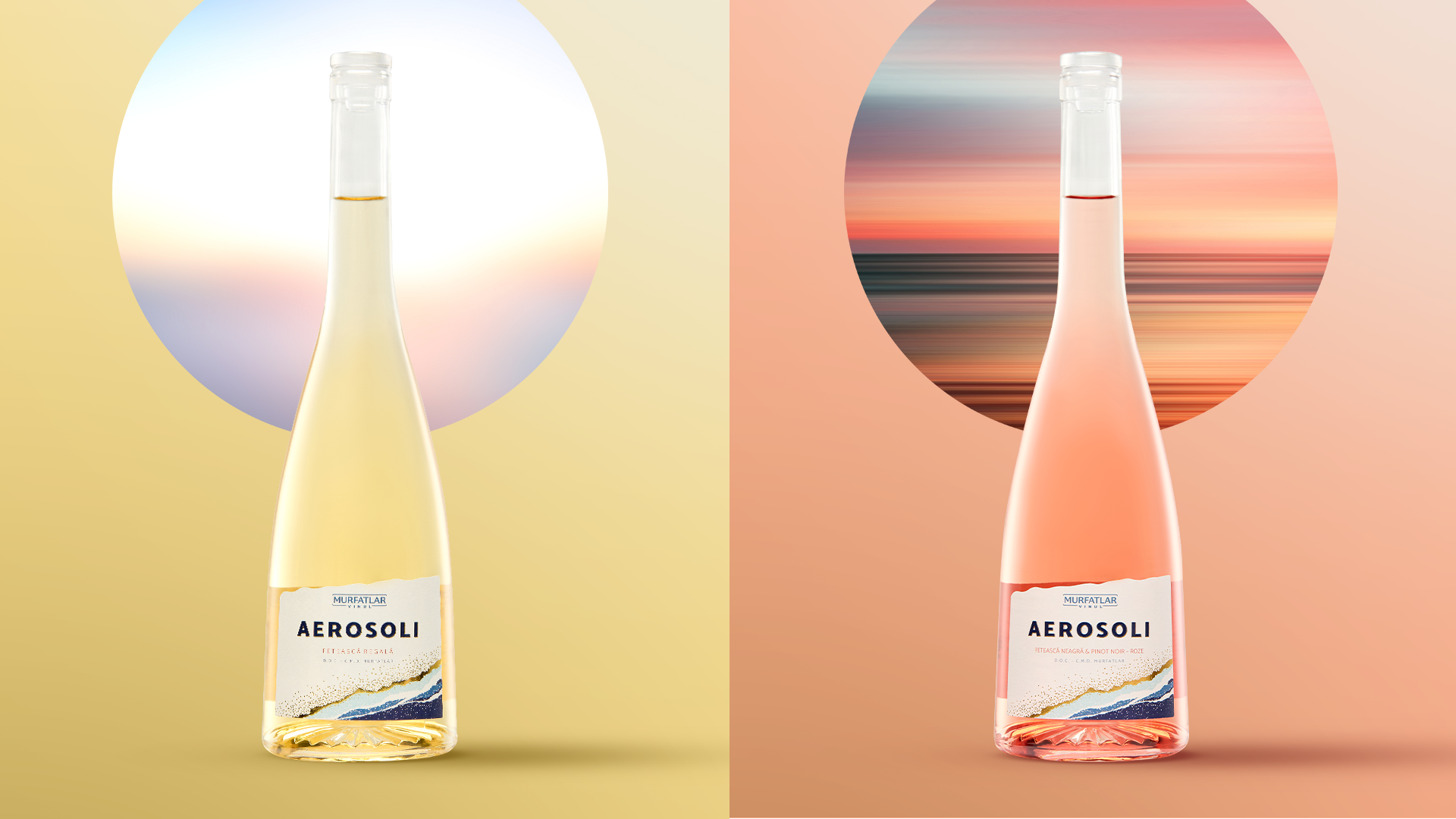
ZIZIN
Context:
In a category dominated by traditional visual codes such as mountain landscapes and pristine springs, Zizin set out to reposition itself as a modern brand for families who make smart, conscious choices.
The ambition was to break away from conventional imagery and connect with consumers through a more emotional narrative: “In harmony with yourself”. Instead of highlighting the purity of the source in the usual ways, Zizin aimed to express how water supports everyday well-being and the rhythm of modern life.
CLIENT:
Zizin
BRAND:
Zizin
INDUSTRY:
Bottled Water
TASK:
Logo & Packaging Redesign

The Brief / The Challenge
Our challenge was to rethink Zizin’s visual identity from the ground up, transforming it into a distinctive, emotionally driven brand while integrating the innovation behind its unique double-label system.
The brand needed to communicate modernity and emotional resonance.
We were also tasked with proposing new PET bottle shapes for both still and sparkling water (except large-volume formats), reinforcing a contemporary feel across all touchpoints.
The Solution / Design Concept
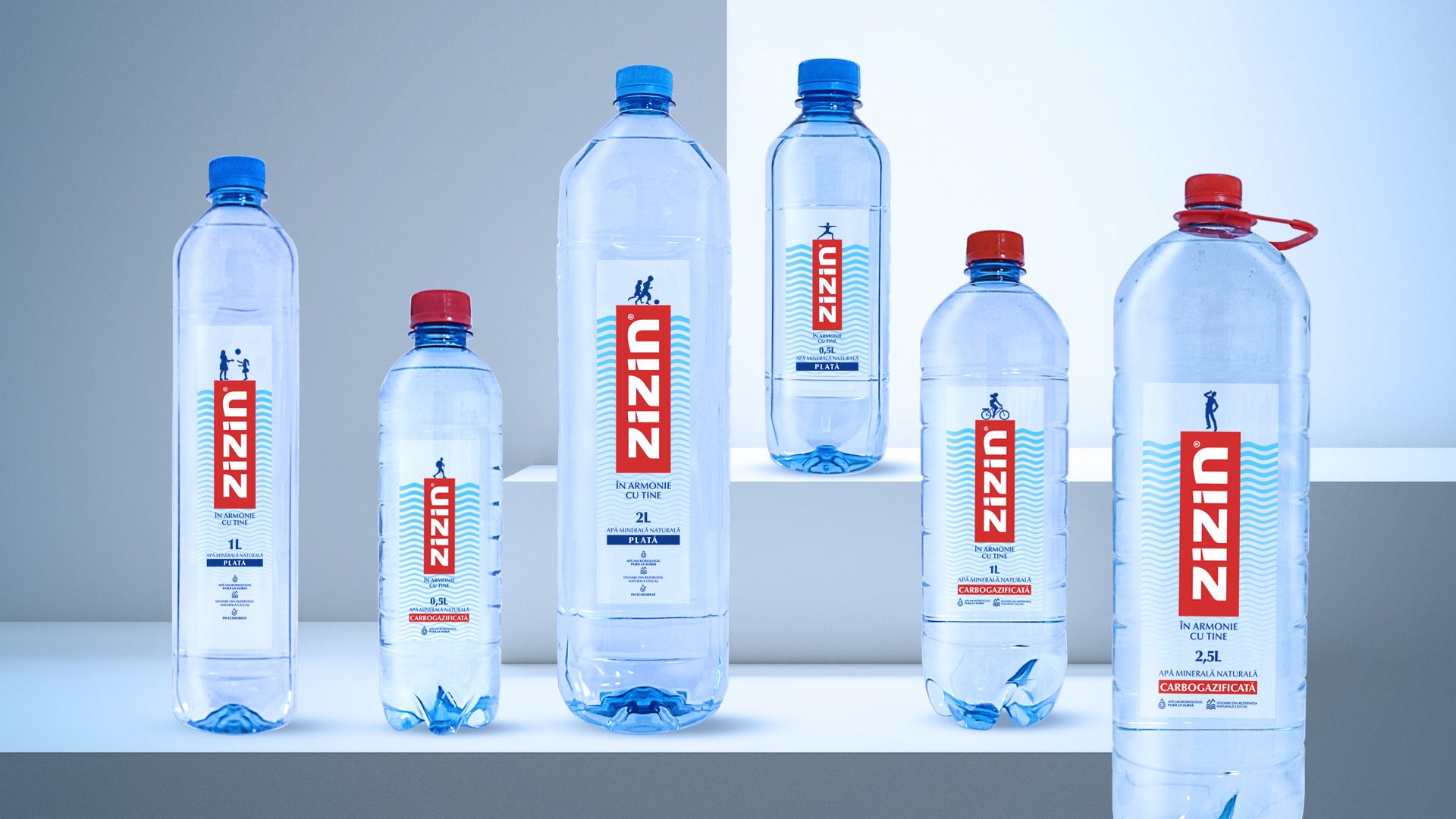
The new design system translates Zizin’s strategic positioning into a bold and minimalist visual identity that deliberately avoids typical water category clichés.
The logo is redesigned to stand out with clarity and strength, placed inside a clean holding device. This allows the innovative back label, printed on both sides and visible through the transparent front label, to deliver a layered, dynamic look.
The visual narrative of the brand is supported by subtle wave patterns on the reverse label that shimmer through the front, echoing the movement and fluidity of water in a strikingly modern way.
Adding emotional depth, the front label features simple silhouette-style icons illustrating everyday activities, from yoga and running to family time, reinforcing the idea that water is there to support every part of your daily life.


MORE PROJECTS


Follow us
Work
About
Contact
©2025 BRAND NEW