to shape expressive and impactful brands.
SUMMARY
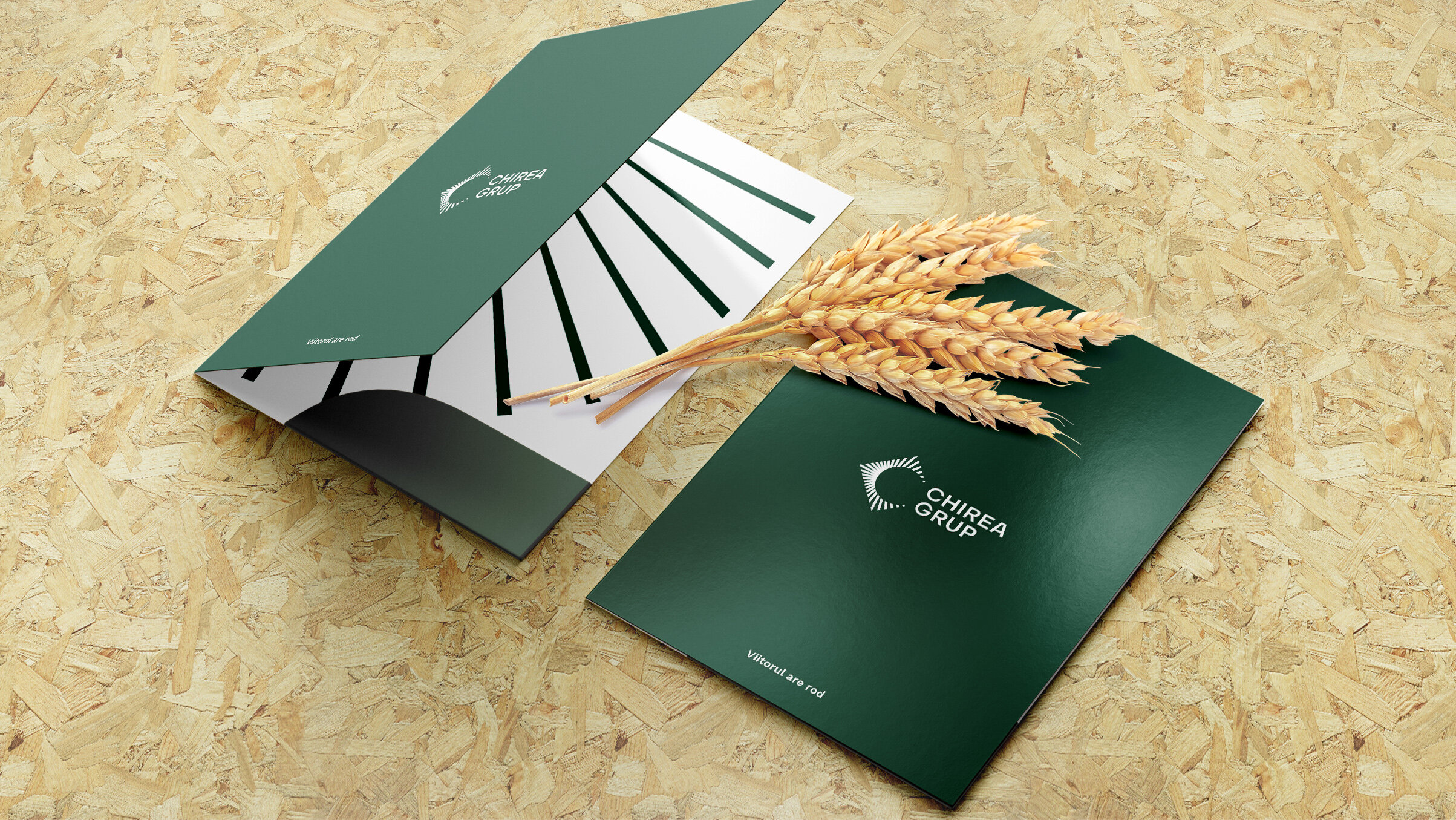
CHIREA GROUP
Context:
Chirea Grup began as a family business, rooted in bakery production. Over time, the company expanded significantly, building highly modern, technology-driven livestock farms, storage silos and a cereal processing plant for animal feed.
Today, Chirea Grup has reached a point of maturity. With strong growth behind it and an eye on the future, the company is ready to consolidate its reputation and turn its name into a recognizable brand.
CLIENT:
Chirea Grup
BRAND:
Chirea Grup
INDUSTRY:
Agriculture
TASK:
Positioning Strategy, Brand Architecture,
Identity Design

The Brief / The Challenge:
Our role was to shape a clear positioning and brand architecture and to define an identity system for the entire business ecosystem.
The challenges were:
- Creating clarity and structure within a diverse portfolio of business units
- Building a unified brand system with cohesion across all sub-brands
- Ensuring each division has distinctiveness while remaining visually connected to the group
The Solution / The Design Concept
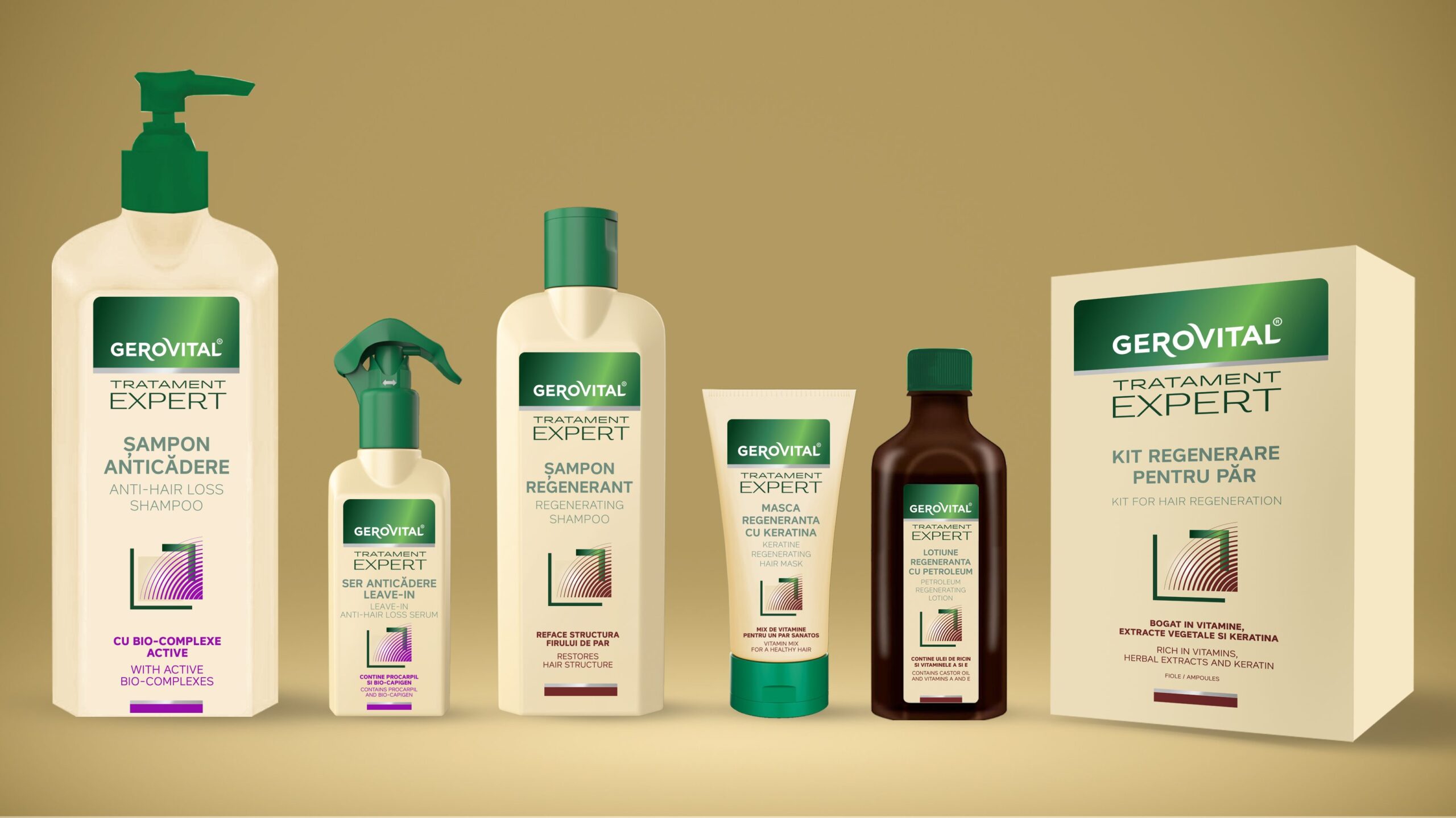
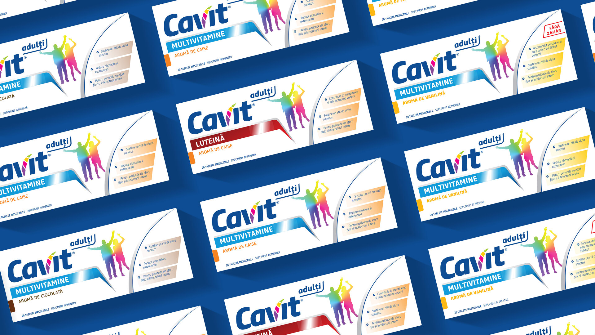
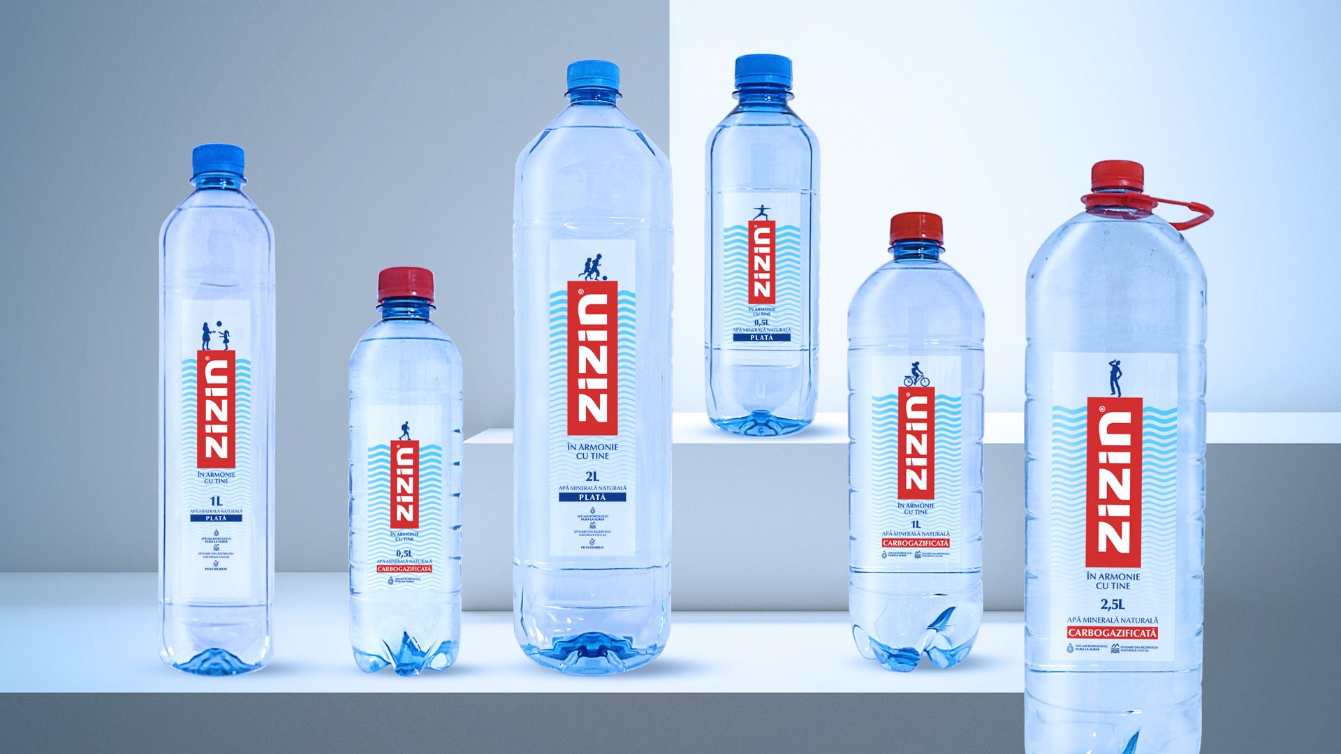
We developed a masterbrand architecture model, with Chirea Grup as the core identity, guiding and connecting all sub-brands. Each division share the same philosophy, visual language and values.
The slogan reflects this forward-thinking mindset: "Viitorul are rod".
At the heart of the identity is a stylized "C" symbol, inspired by the sun, a natural metaphor for agriculture and growth. This minimalist, modern symbol forms the foundation of the main logo and is echoed throughout each division’s logo, maintaining coherence across the system.
Each sub-brand is differentiated by a unique color palette and a distinctive pattern that reinforces its area of expertise.
The result is a modular, scalable identity system grounded in the values of tradition, responsibility and long-term vision.


MORE PROJECTS


Follow us
Work
About
Contact
©2025 BRAND NEW