to shape expressive and impactful brands.
SUMMARY
BONI DE TOT by PENNY
Context:
In the ultra-fresh dairy and cheese category, Boni is a well-known private label, offering a wide range of essential dairy products. Positioned at a basic and competence price level, Boni performed very well among consumers and is associated with simplicity and everyday quality.
However, as the market evolved and design expectations increased, the brand needed a visual update to stay relevant, without losing the recognition and trust it has built over time.
CLIENT:
REWE Romania
BRAND:
Boni De Tot
INDUSTRY:
FMCG
TASK:
Naming, Packaging Design
The Brief / The Challenge:
The project aimed to revitalize Boni through a packaging redesign and naming update, while maintaining accessibility and familiarity for its loyal audience.
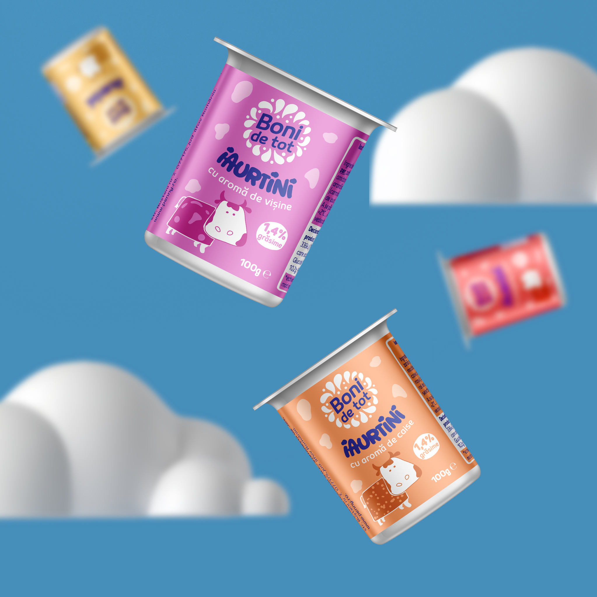
Our task was developing a new visual identity aligned with the price segment, yet modern and warm and creating a look & feel that better communicates freshness and taste.
The challenge was preserving consumer recognition despite a shift in name and packaging.
The name “Boni” transitioned to “Boni de tot” - a subtle evolution meant to infuse more personality into the brand without creating disconnection.
The Solution / The Design Concept
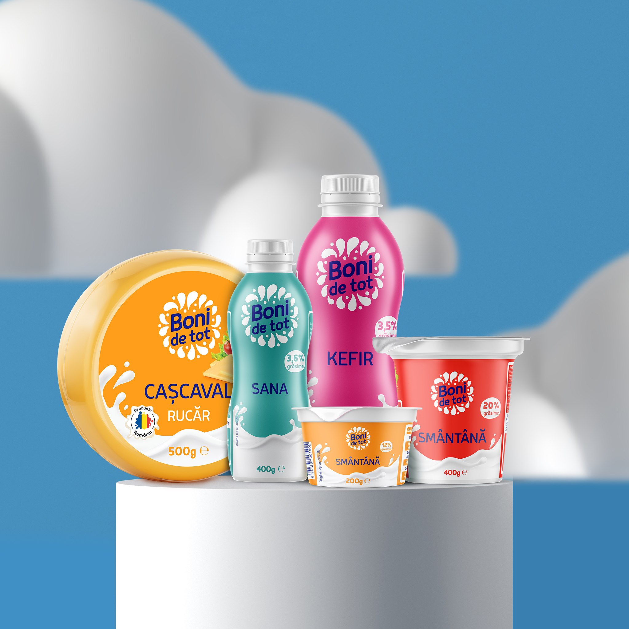
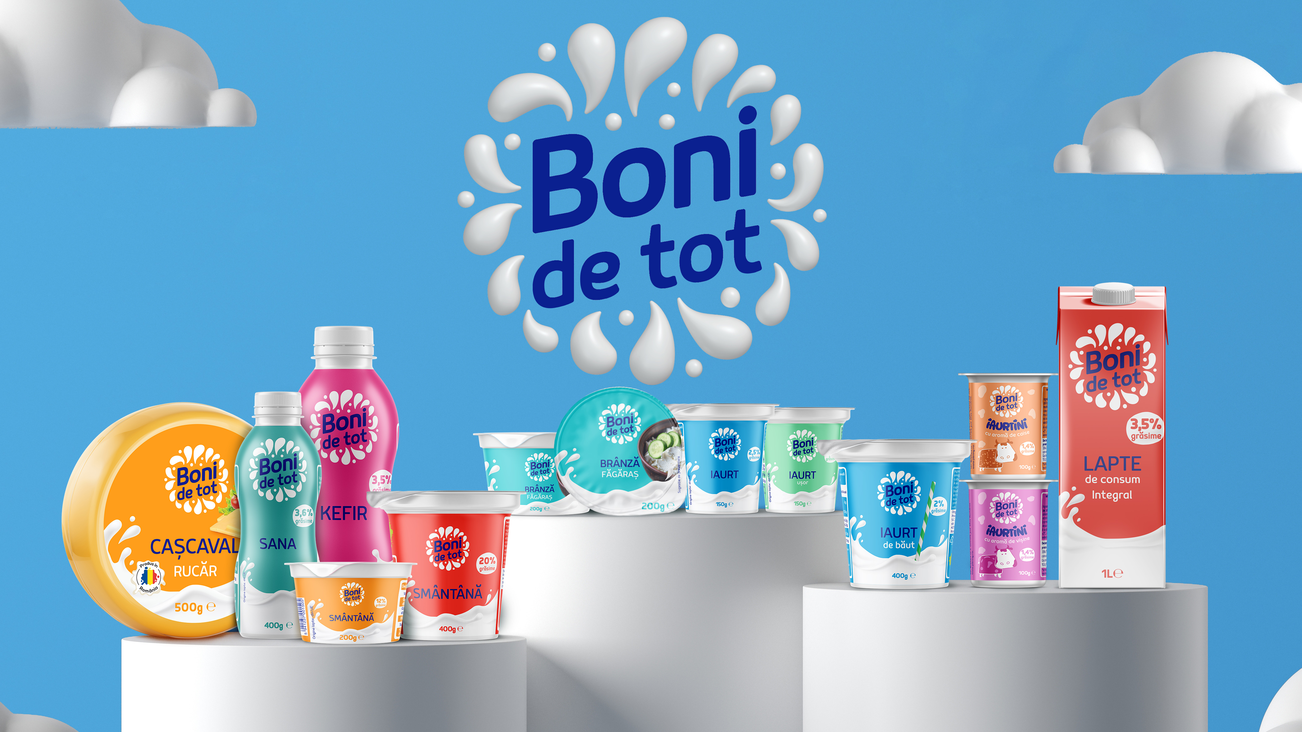
We introduced a new graphic concept that redefines the brand visually while respecting its roots. The new logo composition is decorative and expressive, with clear category-specific visual cues (such as dairy shapes and textures) to signal product type quickly and intuitively.
The design has a visual warmth and friendliness, essential in food branding to convey freshness and approachability. And a consistent and adaptable layout across the range, supporting clear shelf presence and brand cohesion.
MORE PROJECTS





Follow us
Work
About
Contact
©2025 BRAND NEW