to shape expressive and impactful brands.
SUMMARY
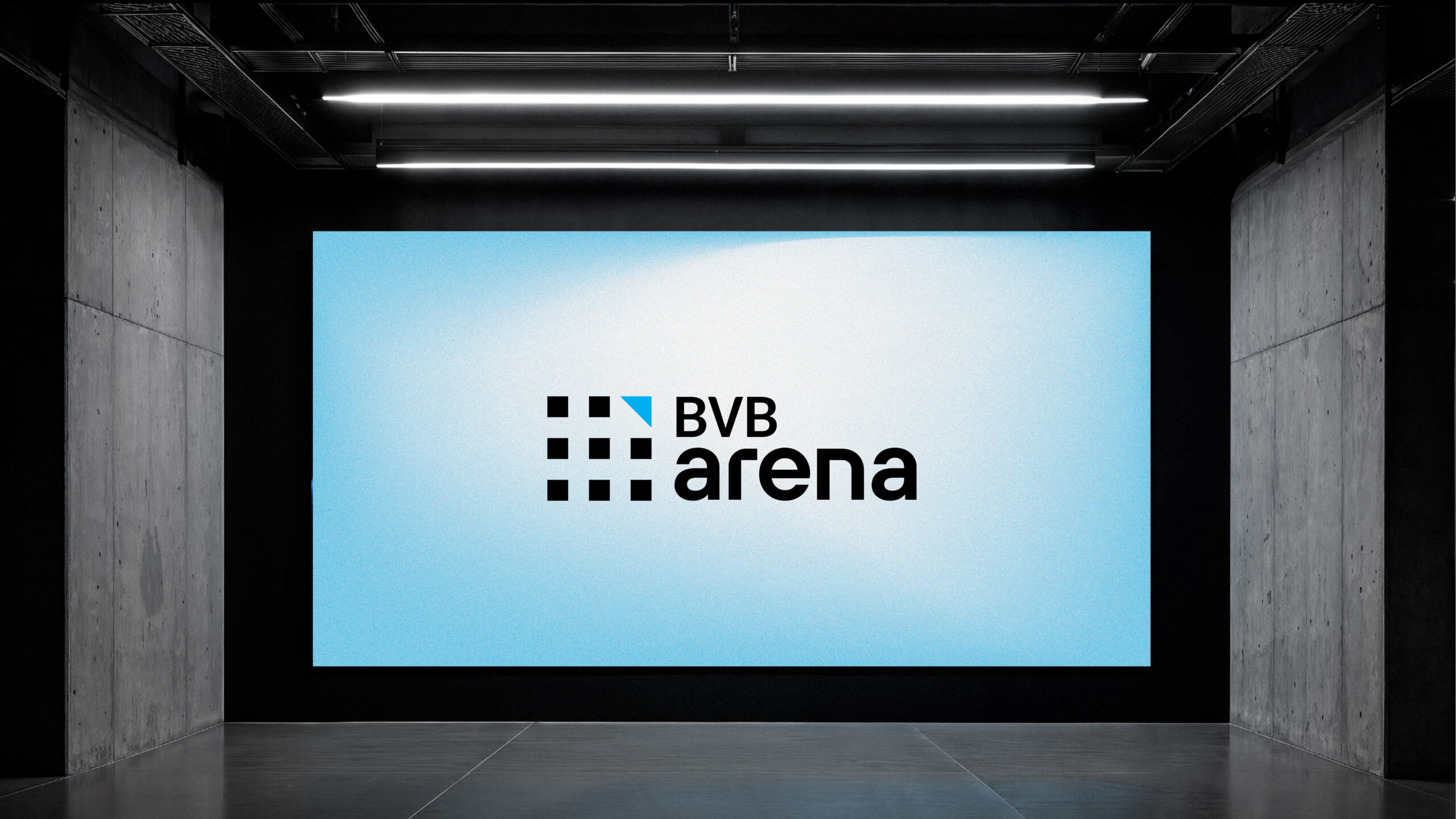
BVB ARENA
Context:
In 2017, the Bucharest Stock Exchange launched Made in Romania — a flagship program and competition designed to spotlight and support Romanian companies.
More than just an accelerator, Made in Romania operates in a higher league — open both to early-stage businesses with bold ambitions and to established corporate players aiming to scale further. At its core, the initiative aims to educate local companies about the potential of capital markets and, by doing so, unlock new pathways to sustainable growth and funding opportunities.
CLIENT:
Bucharest Stock Exchange
BRAND:
BVB Arena
INDUSTRY:
Financial
TASK:
Positioning, Naming & Identity redesign

The Challenge:
The Brief
Developing a new verbal and visual identity for the program-competition — one that addresses all existing inconsistencies while shaping a clear, distinctive, and character-driven brand.
This new identity should not only resolve the current misalignments but also articulate a strong positioning, aligned with the program’s purpose and the broader vision of the Bucharest Stock Exchange. It must speak with clarity, inspire trust, and create a recognizable voice and presence across all touchpoints.

The Solution / The Design Concept
We’ve moved beyond the idea of a simple competition. What we’re building is a vital mechanism for the development of Romanian entrepreneurship. This is not just another accelerator — it is the only true launchpad towards the capital market and access to funding.
With this mission in mind, the new brand aspires to become an enabler of growth for Romania’s most promising businesses — a platform that facilitates their journey to capital markets. That’s how the name was born: BVB Arena.
A name that captures both purpose and presence:
- A space where performance is recognized and celebrated;
- A space where business ideas and entrepreneurial success attract capital — just as athletes’ performance draws applause in the arena;
- A space of opportunities;
- A space where you grow — and emerge stronger, better equipped, and future-ready.
Identity Strategy
In shaping the new identity, we focused on the need for visual coherence with the Bucharest Stock Exchange brand, aligning with its new design language — minimalist, modern, and current. The color palette draws directly from BVB’s identity, ensuring a visually unified ecosystem across all sub-brands.
We also made a clear distinction between the core identity of BVB Arena and the graphic theme of the competitions. While the BVB Arena stands as a constant, the competition visuals can explore more creative directions each year — always grounded in a shared visual DNA.
Logo & Graphic System
The BVB Arena logotype visually expresses the idea of a collective united by a single purpose: growth and performance.
No matter the size, industry, or business model — all companies share the same goal: to evolve.
For the graphic theme of the competition under the new BVB Arena brand, we opted for a fresh, contemporary look with an avant-garde edge, to reflect a forward-looking vision and the spirit of what’s next.


MORE PROJECTS


Follow us
Work
About
Contact
©2025 BRAND NEW