to shape expressive and impactful brands.
SUMMARY
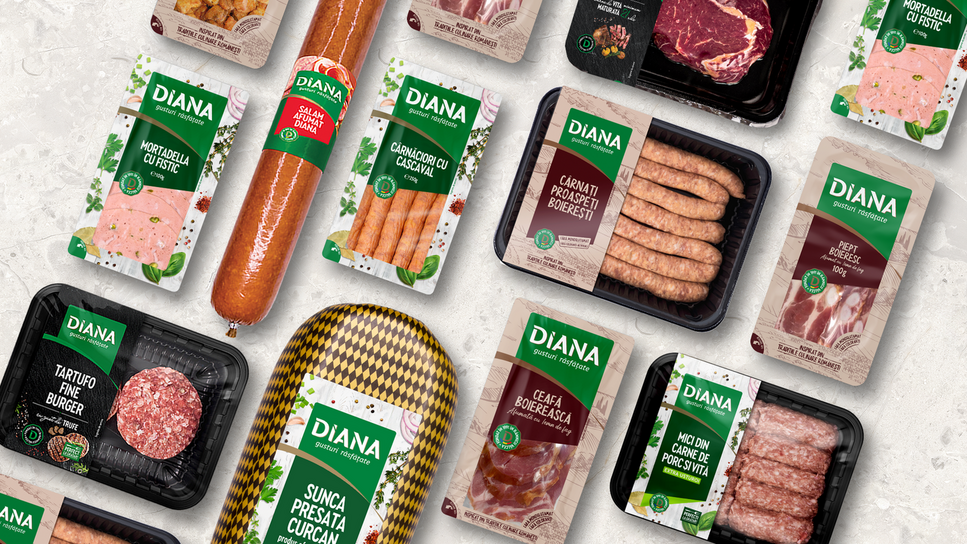
DIANA
Context:
DIANA is a proudly Romanian, family-owned company from Râmnicu Vâlcea, built on tradition, passion for quality meat, and a deep-rooted commitment to doing things right.
For over 32 years, the business has grown steadily and harmoniously within its local community, becoming a trusted name in the region and beyond. With a diverse channel presence and a strong local and regional footprint, DIANA has consistently ranked among Romania’s top 10 slaughterhouses and meat product manufacturers.
Driven by ambition, determination, and the courage to evolve, the brand is now ready to take the next step — scaling its national presence and bringing the authentic taste and values of DIANA to a wider audience across the country.
CLIENT:
Diana
BRAND:
Diana
INDUSTRY:
FMCG
TASK:
Identity & Packaging redesign

The Brief / The Challenge
A refreshed visual identity that breathes new life into the DIANA brand — capturing its enduring passion for delivering authentic, memorable flavors to Romanian households.

The Solution / The Design Concept
The new visual and packaging identity stems from the need to translate the brand’s core values and distinctive personality into a contemporary visual language. The goal was to build a coherent, recognizable, and memorable visual system — one that effectively communicates the brand’s positioning while fostering an authentic connection with its audience.


MORE PROJECTS


Follow us
Work
About
Contact
©2025 BRAND NEW