to shape expressive and impactful brands.
SUMMARY
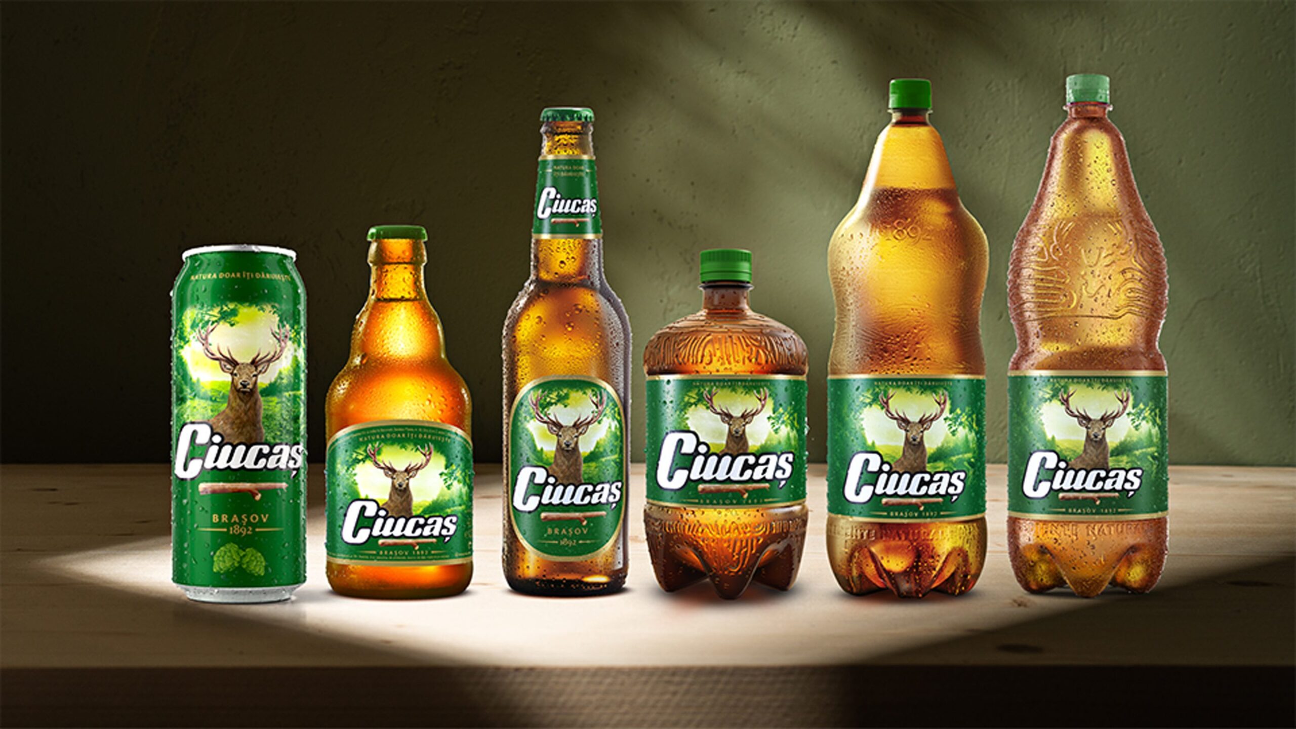
CIUCAȘ
Context:
Even the most important touch point for Ciucaș is the package, the brand faces a inconsistency at AW level due to being developed in different periods of brand evolution: different shades of green, different meadows, different portrayals of the iconic stag.
Ciucaș is leading the economy beer segment, but, the overall beer segment faces a clear tendency of premiumization which affects Ciucaș.
CLIENT:
Ursus Breweries
BRAND:
Ciucaș
INDUSTRY:
Beverages / Beer
YEAR:
Packaging Redesign

The Brief / The Challenge:
Ciucas needs to be competitive and relevant to the consumers who tend to migrate to upscaled brands.
The Solution / The Design Concept
An evolution, not a revolution.
The new design builds on what the brand has already earned — trust, recognition, emotional connection — and refines it with purpose. We’ve created visual unity across the portfolio, bringing consistency while allowing each product to shine.
With a more modern and dynamic approach, the identity is elevated to speak the language of today’s consumers: confident, clean, and clear. The packaging stands out effortlessly, balancing shelf impact with simplicity and clarity.
But above all, we’ve stayed true to the brand’s most essential promise — its deep connection to nature. This comes to life through the bold, expressive use of its core iconographic elements: the logo, the stag, the green, and the meadow. Reimagined with strength and clarity, these timeless symbols now carry even more meaning — reminding consumers not just of what the brand offers, but what it stands for.


MORE PROJECTS


Follow us
Work
About
Contact
©2025 BRAND NEW