to shape expressive and impactful brands.
SUMMARY
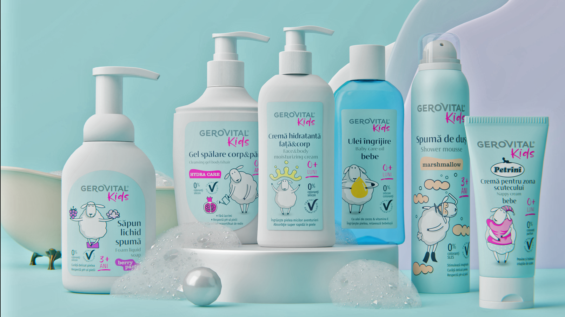
GEROVITAL KIDS
Context:
Gerovital, a well-established name in skincare, aimed to extend its brand into the children’s cosmetics segment through a new line: Gerovital Kids.
In the kids' cosmetics category, safety is paramount. Parents seek products that are soft, harmless and trustworthy above all.
CLIENT:
Farmec
BRAND:
Gerovital Kids
INDUSTRY:
Children’s Skincare
TASK:
Packaging Design

The Brief / The Challenge:
To develop a packaging system that balance the playfulness needed to attract kids with the gentleness and care expected from baby products.
It was important to ensure that the design was visually engaging for children, but also reassuring for parents, with cues of softness, cleanliness and safety.
The Solution / The Design Concept
We developed a packaging concept centered around a friendly, personalized character: a little sheep. Soft, white, calm and innocent, the sheep serves as a universal symbol of sleep and care - a perfect visual metaphor for the brand's gentle promise. Each product variation features a unique illustration of this character, adapted to suit the product's specific purpose or usage moment.
The character becomes a visual signature of the brand, easily recognizable and extendable across communication channels beyond the packaging itself.
To support this, the background colors were kept calm and soothing, reinforcing the perception of gentleness and safety. Bright yet soft tones provide the vibrancy needed for the kids’ segment without overwhelming the delicate nature of baby care.


MORE PROJECTS


Follow us
Work
About
Contact
©2025 BRAND NEW