to shape expressive and impactful brands.
SUMMARY
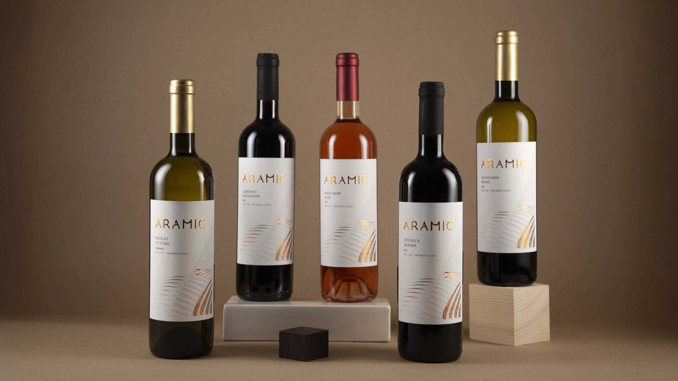
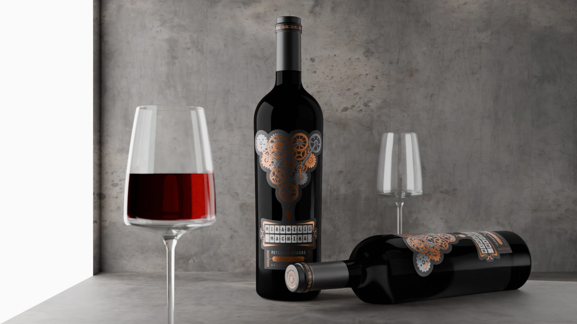
CRAMA ARAMIC
Context:
Crama Aramic is a young, ambitious winery rooted in a unique terroir and a strong respect for nature. As the brand matured, it needed to elevate its identity to match the quality of its wines and move into a more premium, modern space.
CLIENT:
Crama Aramic
BRAND:
Crama Aramic
INDUSTRY:
Wine
TASK:
Positioning Strategy, Brand Identity,
Packaging dDesign

The Brief / The Challenge
To create a distinct positioning, brand identity and packaging for the core range, clearly communicating Crama Aramic’s values: mastery, craftsmanship and a deep connection to nature.
The design had to reflect both tradition and modernity, while setting the foundation for future brand growth.
The Solution / Design Concept
We defined the positioning as The Mastery of Intersections - where nature, craft and passion meet. This concept guided the development of a refined visual identity and packaging.
The logo is a custom typographic composition (no symbol), ensuring strong brand presence and layout flexibility. The letterforms are based on circular shapes, symbolizing the cyclical nature of winemaking.
The design reflects the winery’s landscape, with abstract forms inspired by the surrounding hills and valleys. Premium finishes - including copper foil, embossing - elevate the brand’s shelf presence.
This core range becomes the visual ambassador of the winery, a refined blend of origin, expertise and emotion.


MORE PROJECTS


Follow us
Work
About
Contact
©2025 BRAND NEW