to shape expressive and impactful brands.
SUMMARY
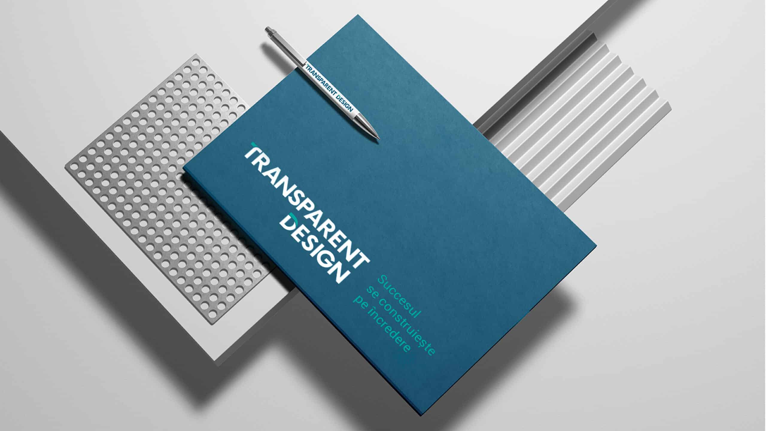
TRANSPARENT DESIGN
Context:
The glass processing market is highly fragmented, with many players of similar size and capabilities.
It is a space that demands continuous, large-scale investments in advanced equipment and technology.
Reputation is built through direct client relationships and the proven success of delivered projects.
Within this landscape, Transparent Design stands out as one of the key players, backed by consistent business growth and a strong market presence.
The opportunity moving forward lies in building a consistent and relevant brand communication, starting with a redefinition of the strategic territory and a refresh of the visual identity — to better reflect the company’s ambition, differentiation, and long-term vision.
CLIENT:
Transparent Design
BRAND:
Transparent Design
INDUSTRY:
Glass
TASK:
Identity Redesign

The Brief / The Challenge
Building on the new brand positioning, updating the identity elements becomes essential — to anchor the brand in today’s market context and prepare it for the future. This evolution ensures that the brand remains relevant, distinctive, and aligned with its long-term ambitions, while also reflecting its maturity and readiness to lead in a changing landscape.

The Solution / The Design Concept
In a market that is constantly shifting, relevance is no longer just about being seen — it’s about being understood, recognized, and remembered. This update was not a cosmetic refresh, but a strategic move that ensures the brand stays aligned with the expectations of its clients, partners, and industry peers.
The goal was to bring coherence between positioning and expression:
- To visually express the brand’s strengths — clarity, professionalism, technological know-how;
- To signal ambition and direction, not just legacy;
- To build a future-facing identity that speaks to both current and potential stakeholders.
Updating the identity elements means modernizing the logo, refining the visual language, and adjusting the tone of voice — all while staying rooted in the brand’s DNA. It’s about creating a flexible yet consistent system that works across touchpoints and scales with the company’s growth.
This step is not just timely — it’s transformative. It will help reposition the brand in the eyes of the market and open the door to new business opportunities, talent, and partnerships.


MORE PROJECTS


Follow us
Work
About
Contact
©2025 BRAND NEW