to shape expressive and impactful brands.
SUMMARY
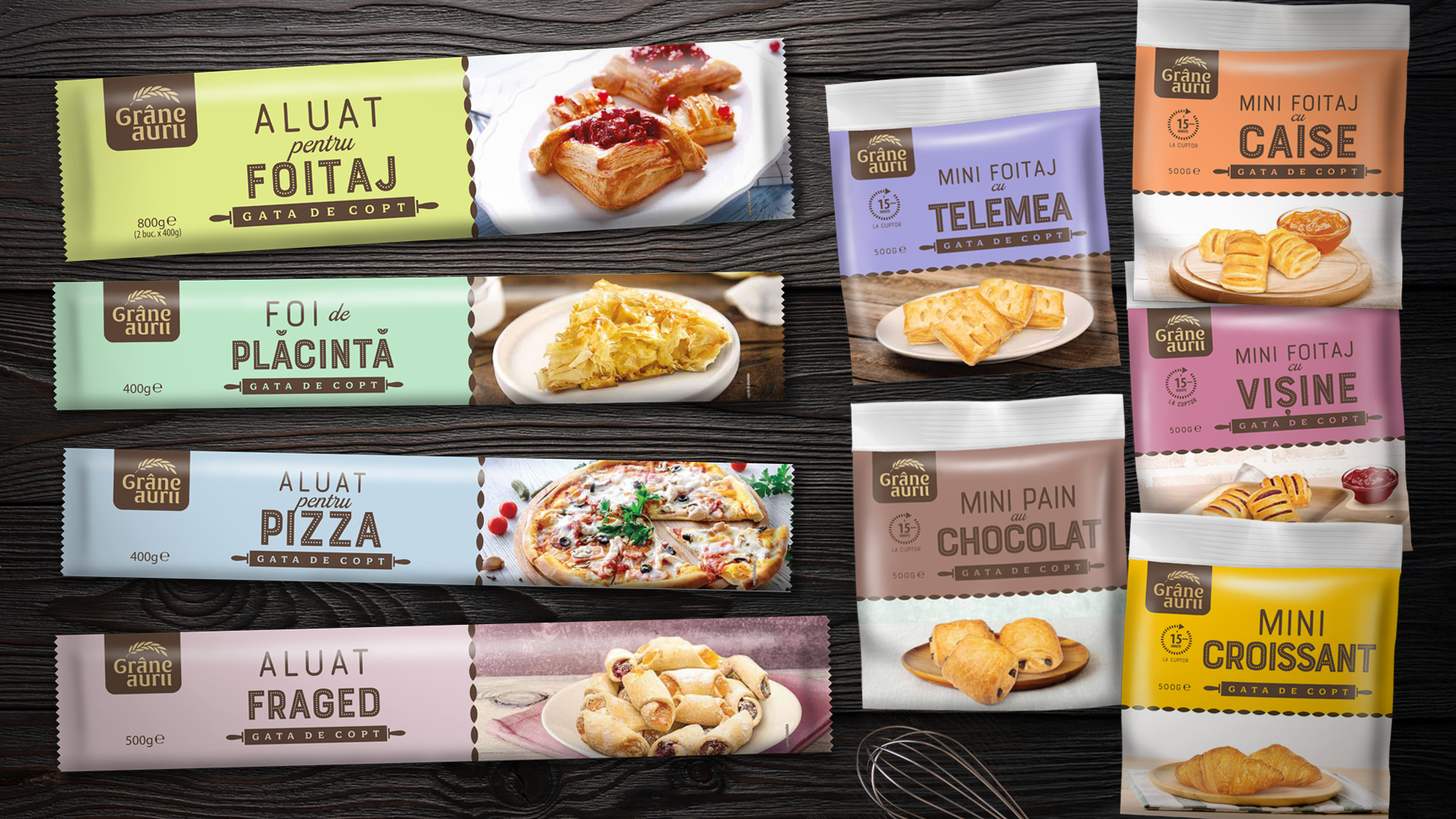
CAVIT
Context:
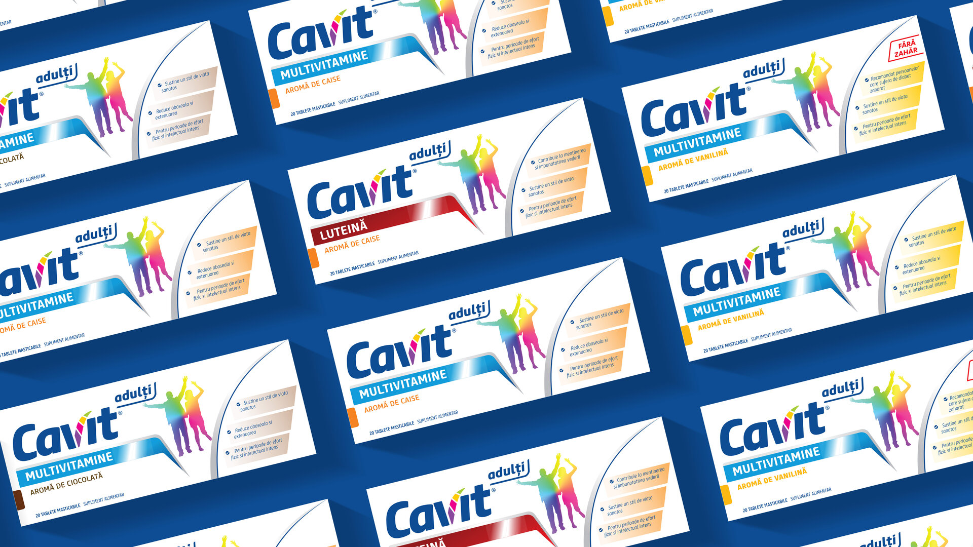
Cavit is a heritage brand with a complex product portfolio, structured under two sub-brands: Cavit Junior and Cavit 9 Plus. Covering a wide range of consumer needs, it remains one of the few brands in its category that continues to enjoy strong emotional attachment from its audience.
Despite this, the Cavit 9 Plus product line currently lacks a clear visual identity. The box format resembles that of a children’s syrup, which creates confusion and misleads the consumer — emphasizing the need to refocus communication on the product’s actual benefits and the specific needs it addresses.
Meanwhile, Cavit Junior stands out on the shelf due to its distinct shape, but it fails to clearly convey what the product inside is or does. The lion mascot on the packaging adds a helpful layer of recognition, but its design lacks personality and emotional appeal — it appears static, overtly masculine, and somewhat unapproachable for children. To strengthen the brand’s relevance and resonance, the character needs more warmth, energy, and a sense of playful identity.
CLIENT:
Biofarm
INDUSTRY:
Pharma
BRAND:
Cavit
TASK:
Packaging Design

The Brief / The Challenge
The goal was to build a modern, contemporary brand and packaging identity — one with personality, credibility, and a sense of expertise. Through this new positioning, Cavit presents itself as a complete range of vitamins and minerals, delivered in a uniquely formulated chewable tablet that offers the advantage and assurance of full therapeutic efficacy.
The Solution / The Design Concept
Two audience-specific product lines, united under a single brand.
For the sub-brand targeting adults, we chose a clear descriptor to eliminate any confusion regarding the intended audience. In terms of design, we pursued a unified look & feel — a red thread running consistently through both lines — creating visual synergy across the brand while allowing enough differentiation for each range to remain relevant to its specific audience.
For Cavit Adults, the objectives focused on:
- Enhancing the perceived efficacy of the product (by emphasizing key benefits and through graphic treatment)
- Improving brand visibility
- Minimizing the emphasis on flavors, to shift away from the “childlike” perception
For Cavit Junior, the objectives included:
- Selecting a single, consistent character — the lion — from the previous visual system
- Strengthening the perception of efficacy (by highlighting product benefits)
- Increasing brand visibility
- Using a vibrant color palette, aligned with the world of childhood


MORE PROJECTS


Follow us
Work
About
Contact
©2025 BRAND NEW