to shape expressive and impactful brands.
SUMMARY
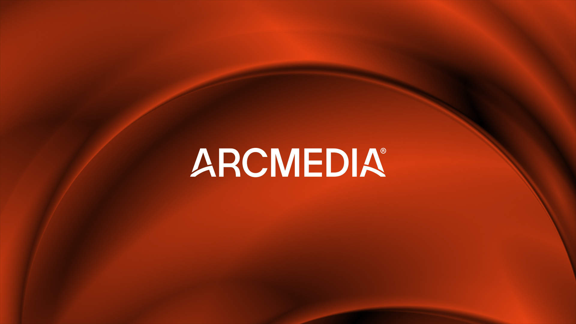
ARCMEDIA
Context:
The local media landscape is highly fragmented, reflecting a reality shaped by multiple perspectives and interconnected narratives. Truth is no longer captured from a single angle, but emerges from the dialogue between viewpoints.
Romanian audiences consume news from a wide range of sources and in very different ways — some through television, others through social media, and many through digital niche platforms. Yet they share a common need: the desire to feel represented.
In an increasingly polarized society, the importance of a shared space — where different voices can coexist without canceling each other — becomes essential.
CLIENT:
Gandul Media Network
BRAND:
ARCMEDIA
INDUSTRY:
Media
TASK:
Brand Positioning, Brand Architecture,
Naming, Identity Redesign

The Brief / The Challenge
Within this context, the need emerged for a modern corporate brand capable of uniting editorial expertise with digital innovation and pluralism.
The objective was to create a group brand that could become the voice of all voices - a shared platform designed to bring together: media titles with distinct personalities, diverse and sometimes divergent audiences, multiple content formats and expressions. The brand needed to function as a platform of coexistence: plural, democratic, and balanced - offering audiences a sense of representation, while providing advertisers with scale, diversity, and comprehensive reach.
The core challenge was to build a unifying identity without diluting editorial individuality - creating cohesion without uniformity, and trust without centralization of perspective.

The Solution / The Design Concept
The project was developed from the ground up, encompassing brand strategy, naming, identity, and a complete visual system.
The name Arcmedia symbolizes a perspective that connects ideas, people, and information into a coherent narrative, positioning the brand as one that does not choose sides, but instead creates spaces for dialogue.
The visual identity is anchored in the graphic element of the arc, suggested by the name itself, expressing purpose-driven energy — much like a company that leads change rather than merely observing it.
The tagline — “Uniting Perspectives” — captures the brand’s mission to bring together ideas, people, and information into a cohesive narrative.
A bold orange was chosen as the core color, encapsulating evolution and leadership. Together with the rest of the visual assets, it builds a memorable, contemporary, and scalable identity, with a distinctly digital, future-oriented look and feel.


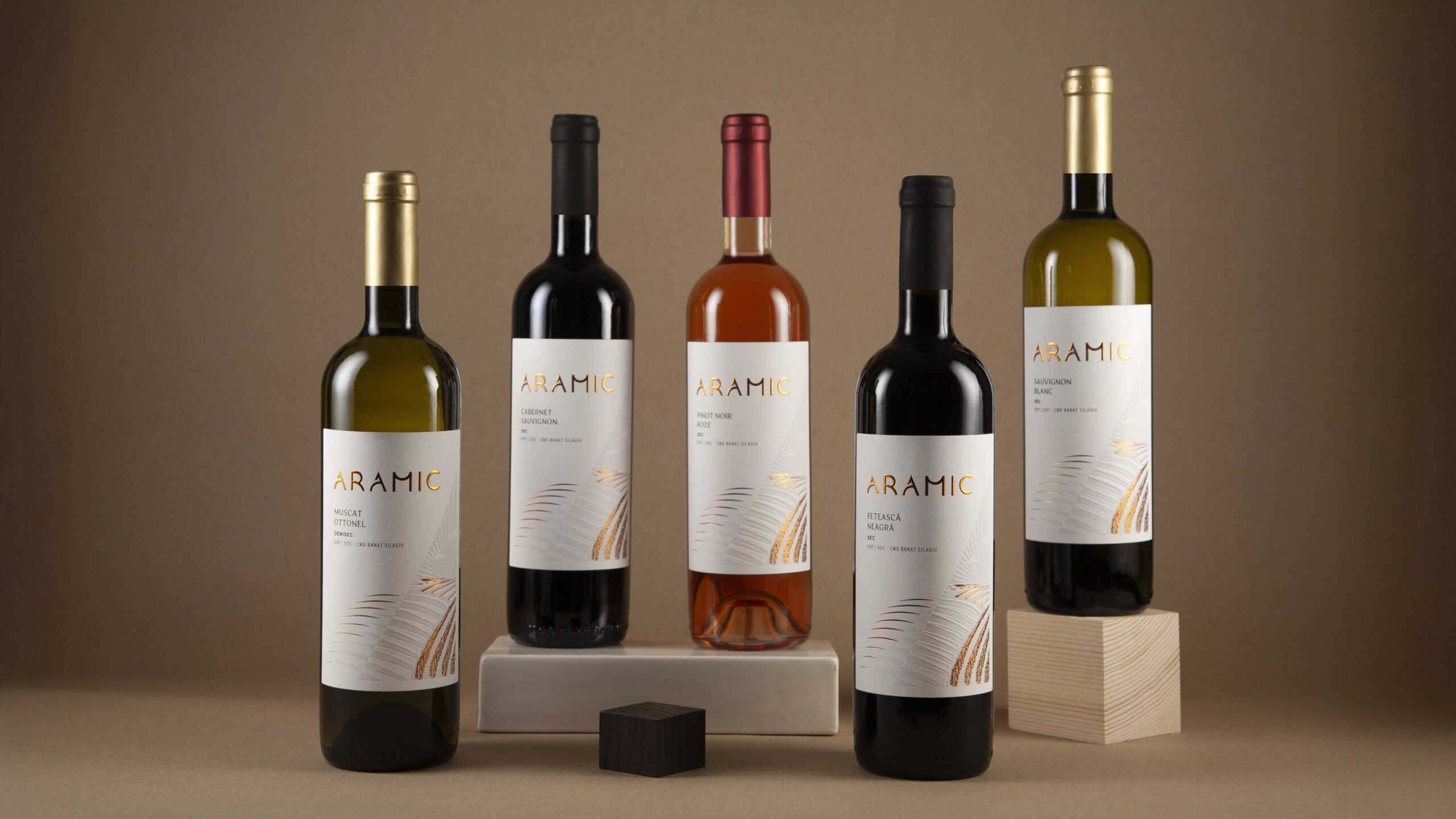
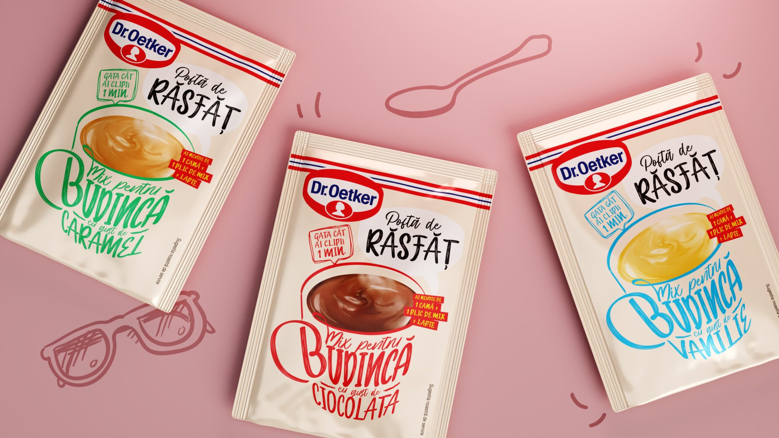
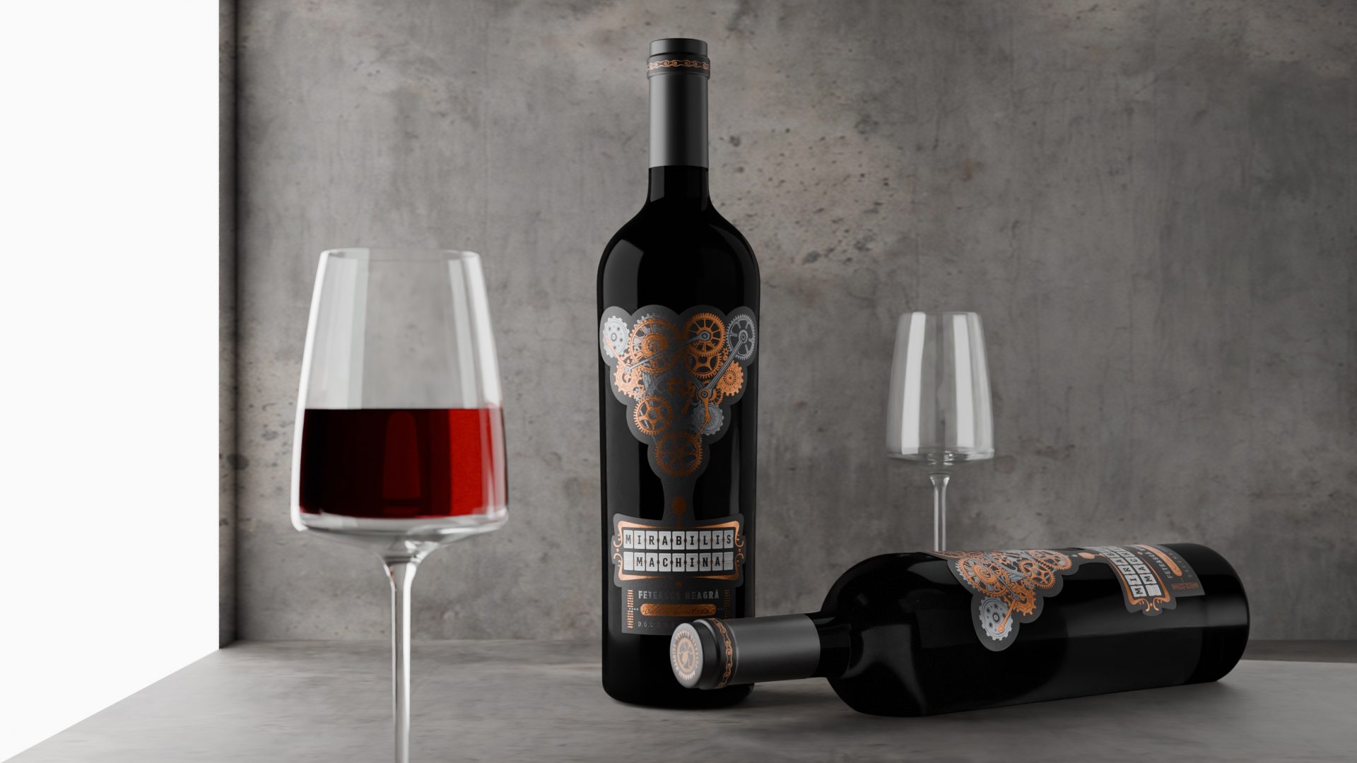
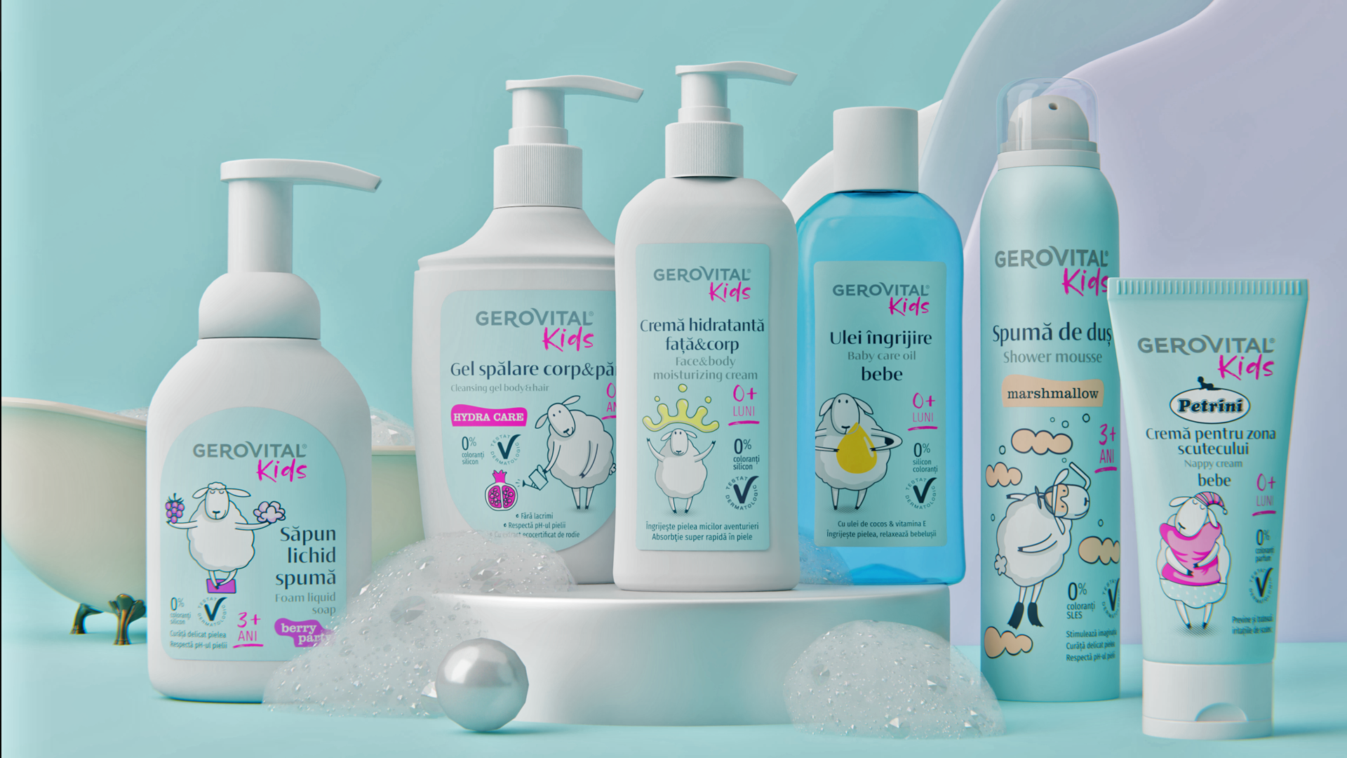
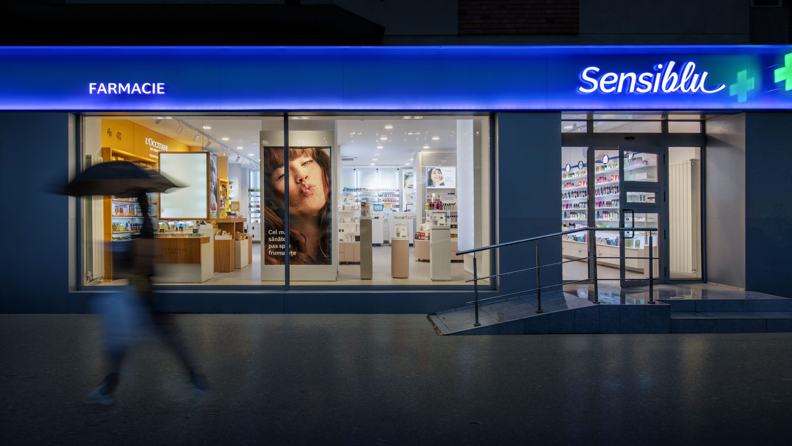
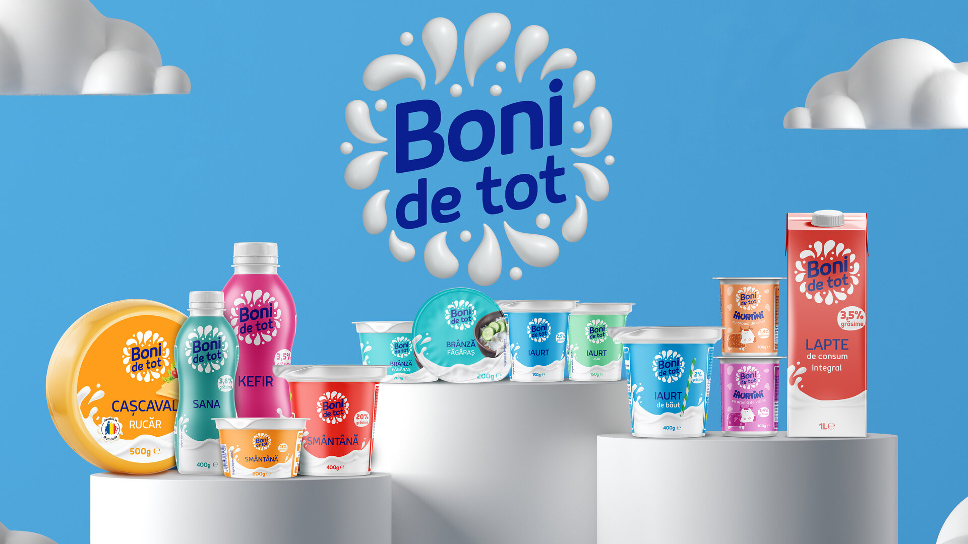
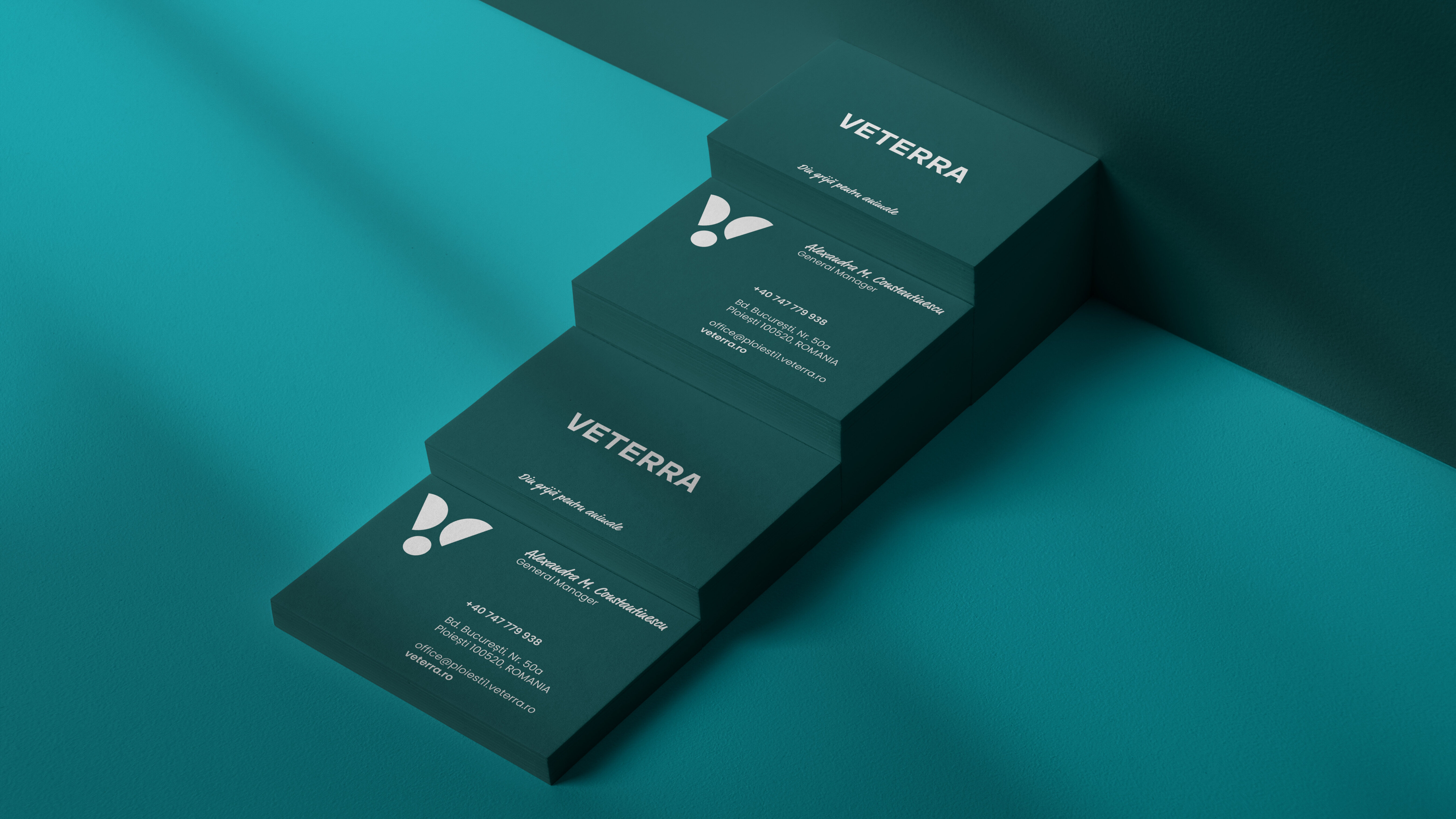
MORE PROJECTS


Follow us
Work
About
Contact
©2025 BRAND NEW